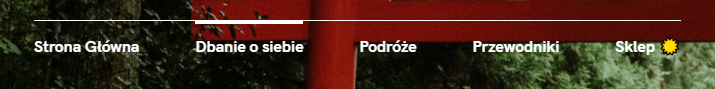
Chciałbym zrobić podobną animacje jak ze zdjecia na lini nad przyciskami (https://i.stack.imgur.com/08FEE.png)
<!DOCTYPE html>
<html lang="pl">
<head>
    <title>Travel</title>
    <!--Shorcut -->
    <link rel="shortcut icon" href="https://icons8.com/icon/108778/around-the-globe" >
    <!--Bootstrap -->
    <link rel="stylesheet" href="https://stackpath.bootstrapcdn.com/bootstrap/4.3.1/css/bootstrap.min.css" integrity="sha384-ggOyR0iXCbMQv3Xipma34MD+dH/1fQ784/j6cY/iJTQUOhcWr7x9JvoRxT2MZw1T" crossorigin="anonymous">
    <script src="https://stackpath.bootstrapcdn.com/bootstrap/4.3.1/js/bootstrap.min.js" integrity="sha384-JjSmVgyd0p3pXB1rRibZUAYoIIy6OrQ6VrjIEaFf/nJGzIxFDsf4x0xIM+B07jRM" crossorigin="anonymous"></script>
    <!--Polish words-->
    <meta charset="UTF-8">
    <!-- include style -->
    <link rel="stylesheet" href="../styledopodstron/style_podroze.css">
    <!--Responsive-->
    <meta name="viewport" content="width=device-width, initial-scale=1, shrink-to-fit=no">

</head>
<body>
<!--Script-->
<script src="../js/podroze_script.js"></script>
<!--Background-->
<div class="background_img">
    <!--Loop-->
<div id="search" class="nav justify-content-end">
    <button id='button1' class="nav-item hover_button">
        <img class="img-fluid "  src="https://img.icons8.com/ios/35/ffffff/search--v1.png" alt=""/>
    </button>
</div>
    <!--Center-->
    <div id="center_logo">
        <button class="hover_button">
            <svg xmlns="http://www.w3.org/2000/svg" x="0px" y="0px"
                                       width="150" height="150"
                                       viewBox="0 0 172 172"
                                       style=" fill:#000000;"></svg>
        </button><br>Around globe
    </div>
    <div id="under_center" class="">
        <ul class="nav justify-content-center">
        <li class="nav-item ">
            <button id="main_Page"><a  class="nav-link active text-white" aria-current="page" href="#" style="border-top:2px solid whitesmoke;text-decoration: none;">Main page</a></button>
        </li>
            <li class="nav-item ">
                <button><a  class="nav-link active text-white" aria-current="page" href="#" style="border-top:2px solid whitesmoke;text-decoration: none;">Journeys</a></button>
            </li>
            <li class="nav-item ">
                <button> <a  class="nav-link active text-white" aria-current="page" href="#" style="border-top:2px solid whitesmoke;text-decoration: none;">Documents</a></button>
            </li>
            <li class="nav-item ">
                <button><a  class="nav-link active text-white" aria-current="page" href="#" style="border-top:2px solid whitesmoke;text-decoration: none;">Guides</a></button>
            </li>
            <li class="nav-item" style="border-top:2px solid whitesmoke;text-decoration: none;padding-left:10%">
                <button><a  class="nav-link active text-white" aria-current="page" href="#" style="">Shop</a></button >
            </li>
        </ul>
    </div>

</div>

</body>
</html>
body{
    background: #333333;
    display: flex;
    flex-direction: column;
    justify-content: center;
}
.container{
    position: relative;
}
.background_img{
    background-image: url('https://duze-podroze.pl/wp-content/uploads/2019/03/Hakone-Japonia.jpg');
    background-size:cover;
}
button{
    border:none;
    background: none;
    padding:0;
}
#button1{
    border:none;
    background: none;
    padding:0;
    margin-top: 5%;
    margin-right: 10%;
}
button:focus{
    outline: none;
}
.hover_button:hover{
    opacity:0.7;
}
#center_logo{
    text-align: center;
    align-items: center;
    color:whitesmoke;
    font-family: Verdana;
    font-size: 450%;
}
//backlight

const main_Page = document.getElementById("main_Page");


    main_Page.addEventListener("mouseover", function (event){
        event.target.style.boxShadow = "2% 0% 0% whitesmoke";

        setTimeout(function (){
            event.target.style.boxShadow ="";}, 500);
        },false);