Logowanie

Pajacyk od wielu lat dożywia dzieci. Pomóż klikając w zielony brzuszek na stronie. Dziękujemy! ♡
Kolejna edycja największej imprezy hakerskiej w Polsce, czyli Mega Sekurak Hacking Party odbędzie się już 20 maja 2024r. Z tej okazji mamy dla Was kod: pasjamshp - jeżeli wpiszecie go w koszyku, to wówczas otrzymacie 40% zniżki na bilet w wersji standard!
Więcej informacji na temat imprezy znajdziecie tutaj. Dziękujemy ekipie Sekuraka za taką fajną zniżkę dla wszystkich Pasjonatów!
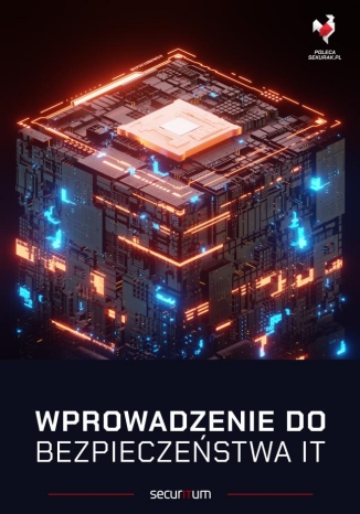
Niedawno wystartował dodruk tej świetnej, rozchwytywanej książki (około 940 stron). Mamy dla Was kod: pasja (wpiszcie go w koszyku), dzięki któremu otrzymujemy 10% zniżki - dziękujemy zaprzyjaźnionej ekipie Sekuraka za taki bonus dla Pasjonatów! Książka to pierwszy tom z serii o ITsec, który łagodnie wprowadzi w świat bezpieczeństwa IT każdą osobę - warto, polecamy!